Interactive Controls TEXT LABEL ... BUTTON
TEXT LABEL

Use this control to show something on screen:


You may also use it as container for AI streaming data, like so:


TEXT INPUT

Use this control to get some textual information from the end user, e.g.

|
|
|


Besides the core properties listed on the Interactive Controls Summary page, you can control in Validation the min and max length of your input, as well as define an entry mask, e.g. ###-###-#### for the phone number.
NUM INPUT

Very similar to the text input above, except you use it to collect numerical data.


In the validation section, you can control the min and max values allowed, as well as the step when clicking on the arrows in the input (typically helpful on mobile devices). If Thousands separator is selected, the entry will auto-arrange itself to make it easier to read. Allow decimals is self-describing; by default, only whole numbers are allowed. By default, all entries are aligned to the right; if you would like the number aligned to the left, you may do so by activating Text align left.
TEXT OUTPUT

This is a general-purpose output control that you can use to format output. There are many options, including alignment, font color and background color, links, etc.


You can also use this control to insert media — images or videos:


While you can type variable directly in this control, we recommend you use the {} Add Variable functionality to ensure you get the correct format.

When using variables, if you encounter any issues, be sure that there is no extra formatting impacting the variable output. The text may look fine on the designer/on-screen, but when you look at the source, there may be invisible formatting applied.

PARAGRAPH

Use this control to collect free-flowing text, over multiple lines.

You can set the minimum and maximum length of the entry:

At runtime, users may stretch the paragraph box to show more lines:


LINK

This control is used to present a link to your end users. This may also be styled as a simple button).


If your Style is configured to show links as buttons, this control will show up as a button, with the color and appearance you set. Otherwise, it will show up as a link.
In Link to open / step name, you may enter variables, so for example you may enter the output of some process and set the Download link to offer to download some document or image; you may create a menu by entering the name of a step in your app etc.
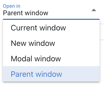
By default, links will open in the same window; you may choose to set Open in new tab if you choose to do so, or even Open in modal overlay.

BUTTON

The button control allows to configure dynamic buttons and offers a wide range of capabilities in content and style.
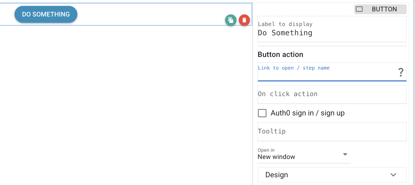
Link to open /step name can be:
- a step, e.g. "My Step"
- a link, e.g. https://www.example.com
- a formula / calculated field, e.g.
${formula}; use also to stop a stream${STREAM_VAR}{stop}
The action can run in the current window, a new window, or in a configurable modal window.
On click action (optional, executed before the button action):
${E.Common}{runAPIVar( _ )}- to run an API variable${E.Common}{runDbFunction( _ )}- to run a DB function${E.Common}{setVariableValue( _ , _ )}- to set a user-defined variable value
Important behavior notes:
- `Link to open / step name` value is mapped when step is rendered (not recalculated on each click).
- `On click action` runs on each click.
- `On click action` is triggered without waiting for completion before link navigation, so if both are set they may run in parallel.
Usage guidance:
- Use `On click action` for side effects (set variables, store data, run API, trigger navigation formula).
- Use `Link to open / step name` for direct navigation/open URL behavior.
The new link will be opened in the current window by default, but you may choose to open it in a new window (tab), a modal (which you can configure), or, if the app is embedded on a website, you may open the link in the parent window (it will act like a redirect). Please note that the latter is only one-level deep (e.g. won't work if the Qreli app is embedded into another embed).
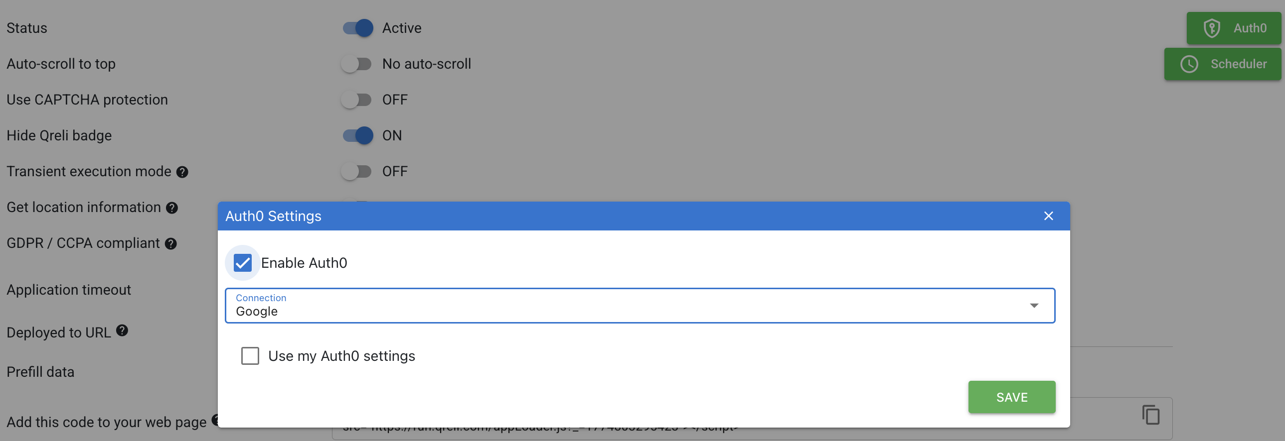
If Auth0 sign in/ sign up is checked, the button will open up the Auth0 modal, set according to your options in Deploy > Settings. After Auth0 flow completion, it will execute the on-click action (if it exists), then navigate to the step / url / formula defined in the button action:
You can make it look full width, add icons to it, color it etc.


You can also customize it more specifically:

